Bake
smarter.
Waste less.
Farine is a mobile inventory management app for artisan bakeries — giving owners like Carlos real-time ingredient visibility, automated alerts, and one-tap reordering so they can focus on what they love.
5+
Wireframe Versions
Paper → lo-fi → hi-fi
4
Competitors Audited
ToastTab · BakeSmart · Kyte · Salesforce
7
Core Screens
Home · List · Detail · Alerts · Reorder
1
Primary Persona
Carlos — NYC bakery owner
Small bakeries are
flying blind on inventory.
Artisan bakery owners rely on memory, paper lists, and gut instinct to track perishable ingredients — leading to costly stockouts, waste, and hours lost every single week.
“I focus on high-quality fresh ingredients while keeping efficiency, minimal waste, and sustainability in mind.”— Carlos, Bakery Owner · New York City
- ⏱Time-consuming manual trackingHours each week spent updating ingredient lists and chasing expiry dates by hand
- 📦Over-ordering & out-of-stock itemsWithout real-time data, guesswork creates both costly waste and critical shortages
- 💸No cost visibilityZero insight into cost-per-unit or usage trends means money left on the table every order
- 🔗No connected reorder flowReordering means leaving the app entirely — no path from alert to action
Problem Statement
Carlos is a small business owner who needs a way to track and manage his bakery’s inventory in real time because manually monitoring ingredients leads to costly stockouts, excess waste, and inefficient ordering.
How Might We…
Design a mobile inventory app that gives bakery owners real-time ingredient visibility, automates low-stock alerts, and makes reordering as frictionless as possible?
Understanding Carlos
before designing for him.
Research combined a competitive audit of 4 tools, a detailed user persona, and a journey map — building evidence before a single screen was sketched.
01
User Persona
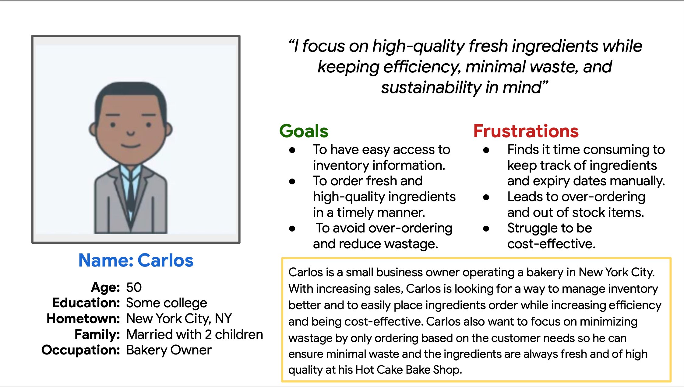
Developed Carlos — 50-year-old NYC bakery owner whose core goal is efficient, waste-minimizing inventory with easy supplier ordering.
02
Journey Mapping
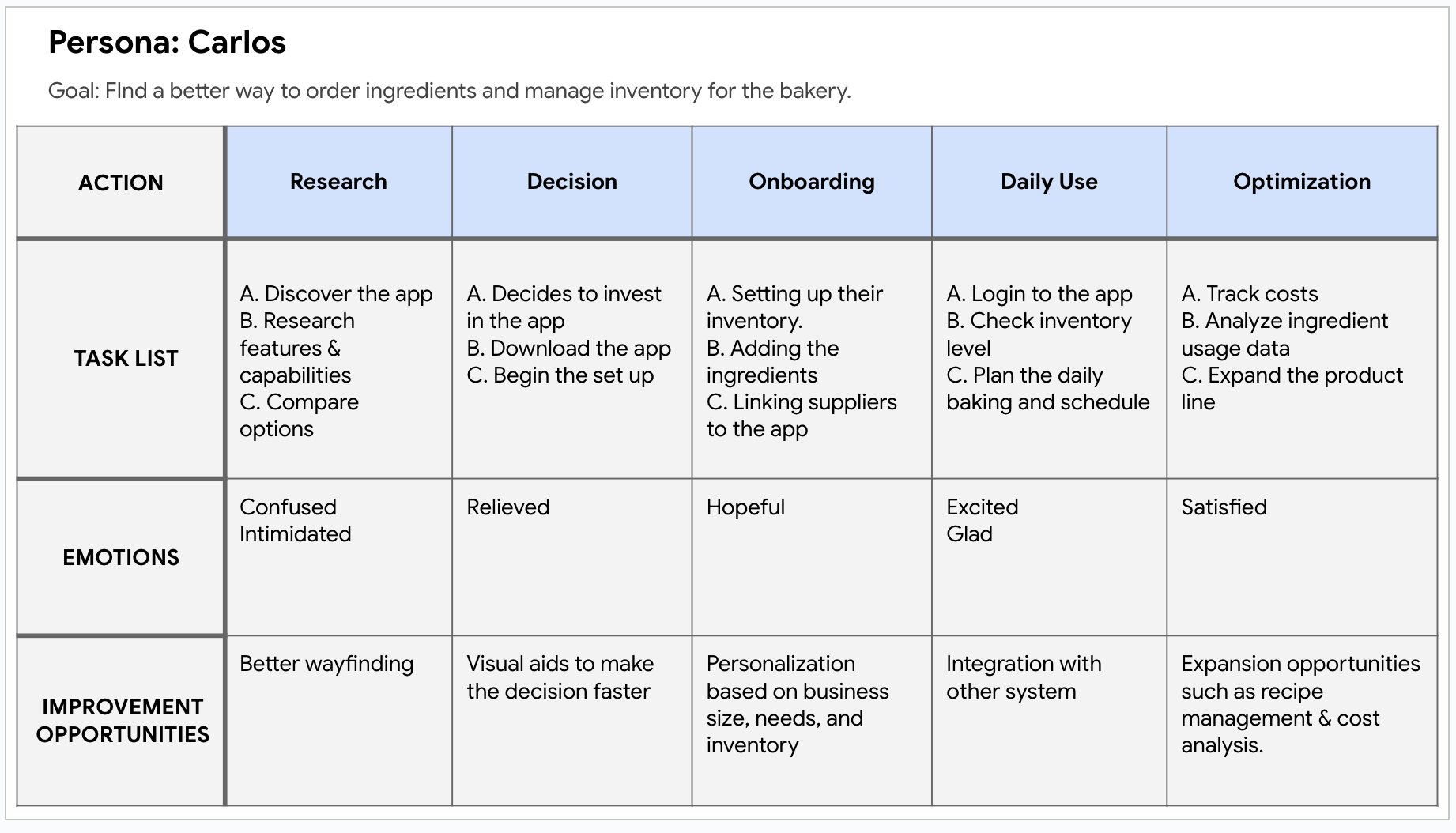
Mapped Carlos across 5 lifecycle stages capturing emotions at each step and identifying exactly where the experience breaks down.
03
Competitive Audit
Analyzed 4 competitors — all shared one critical weakness: poor accessibility and no bakery-specific customization.
Meet Carlos
50-year-old NYC bakery owner running Hot Cake Bake Shop. With increasing sales, he needs a smarter way to manage inventory — reducing waste while keeping fresh, high-quality ingredients stocked.
Goals
- ✓ Real-time inventory access
- ✓ Fresh, timely ingredient orders
- ✓ Minimize waste & over-ordering
Frustrations
- ✗ Manual expiry tracking
- ✗ Leads to over-ordering
- ✗ Hard to stay cost-effective
Carlos’s 5-stage journey — Research · Decision · Onboarding · Daily Use · Optimization — with emotions and improvement opportunities at every phase.
| Competitor | Type | Key Strength | Key Weakness | Accessibility |
|---|---|---|---|---|
| ToastTab | Direct | Intuitive UI, real-time analytics, loyalty | Generic restaurant focus — not bakery-specific | Poor |
| BakeSmart | Direct | Repeat order, one-click payment, bakery-built | No audio features; English only | Limited |
| Kyte | Direct | Affordable, mobile-first, simple setup | No loyalty programs; weak accessibility | Poor |
| Salesforce CRM | Indirect | Consistent UI, customizable, loyalty tools | Far too complex for small bakeries | Moderate |
| Farine ✦ | Our Solution | Bakery-specific, real-time alerts, quick reorder | New entrant — needs adoption | Designed In |
Gap Found
No competitor offers customization for individual bakery workflows.
Gap Found
All 4 competitors have poor visual, cognitive, and language accessibility.
Opportunity
A bakery-first app with built-in ordering, expiry alerts, and accessible UI owns an underserved niche.
From sketches on paper
to pixels on screen.
A full UX design process — hand-drawn storyboards and paper wireframes, through digital lo-fi and mid-fi, to a fully realized hi-fi prototype with five distinct iterations.
Storyboarding
Big picture & close-up
Paper Wireframes
5 homepage versions
Lo-fi Digital
Grayscale mockups
Mid-fidelity
Structure + red alerts
Hi-fidelity
Final Farine prototype
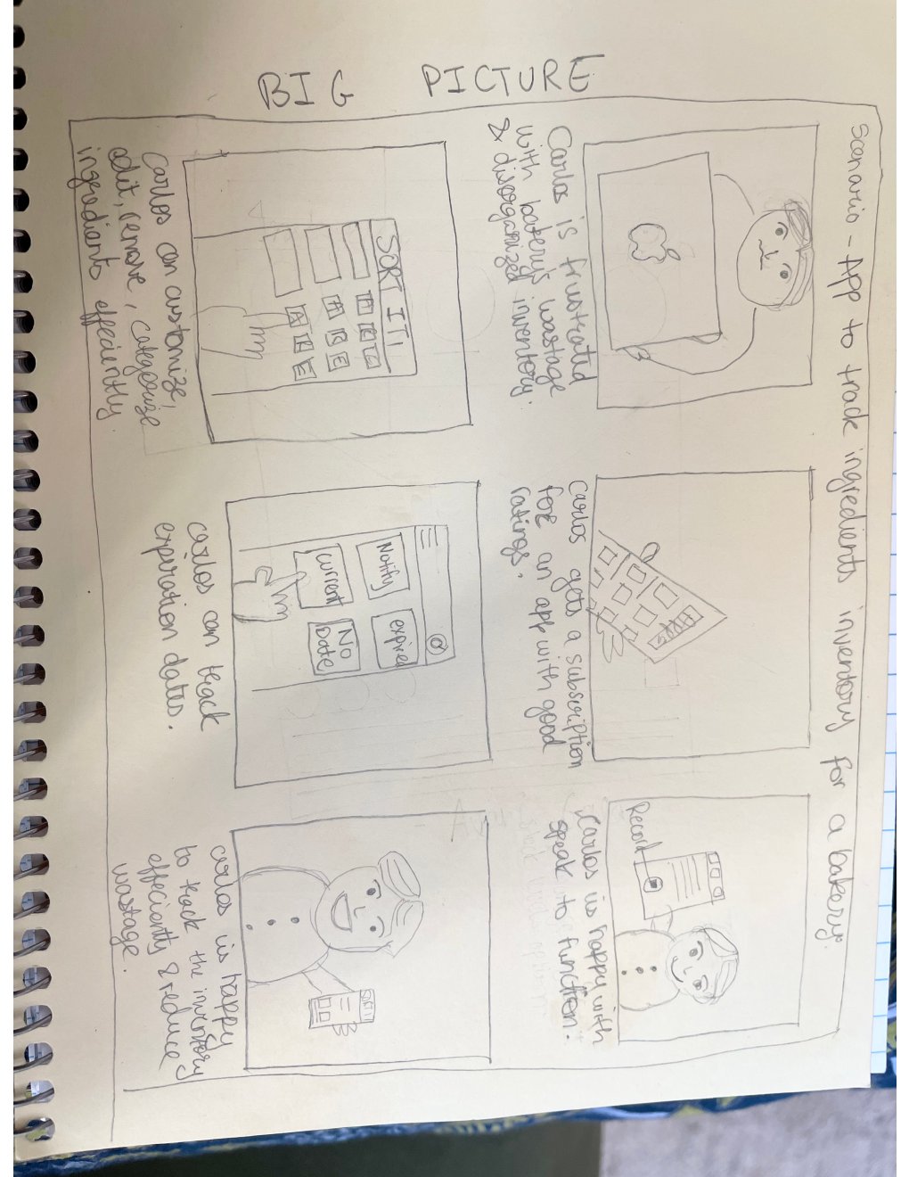
Big Picture Storyboard — Carlos frustrated with wasted inventory discovers Farine, subscribes, tracks expiry dates and stock — ending satisfied and efficient
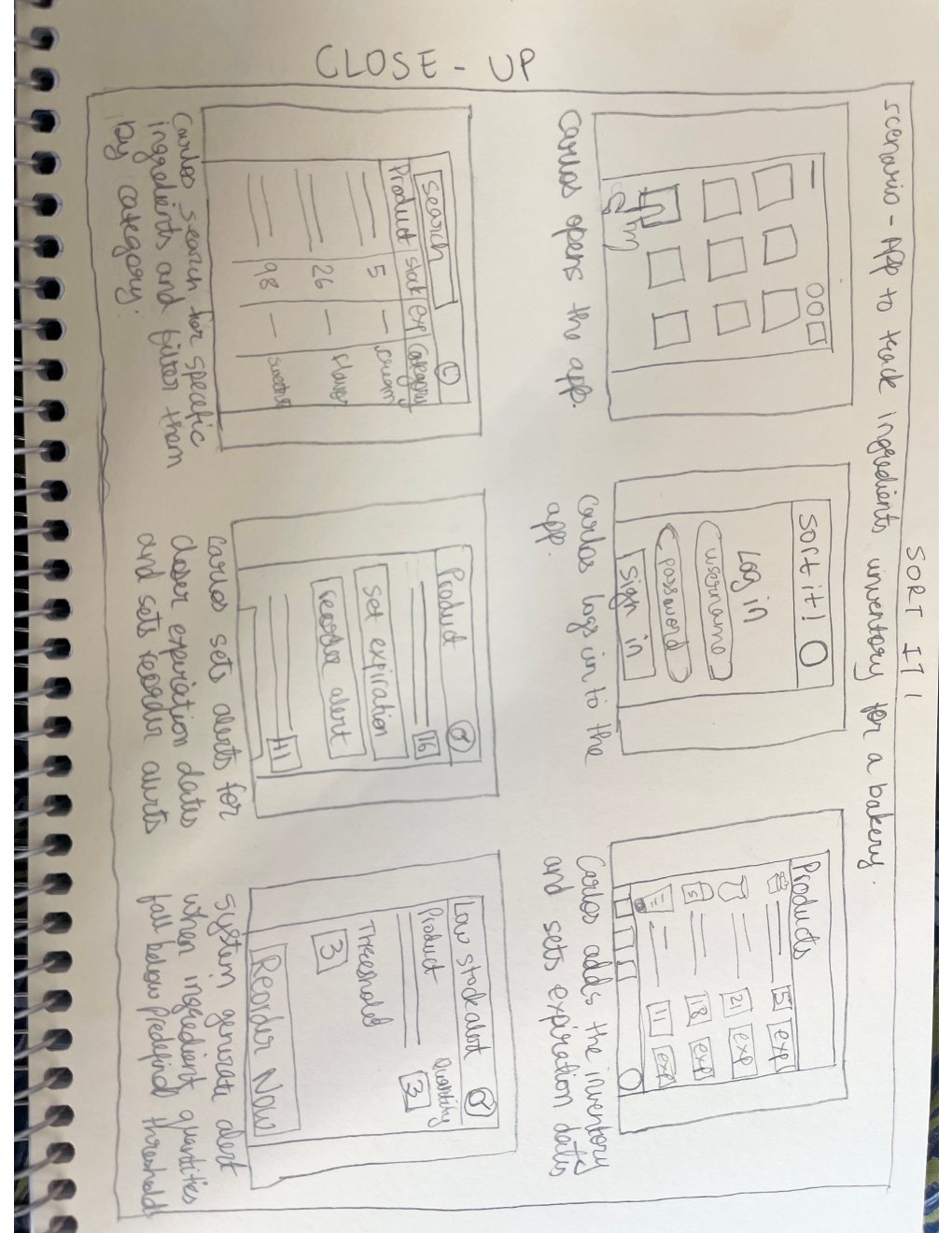
Close-up Storyboard — Detailed flow: Carlos opens the app, filters ingredients by category, sets expiry alerts, receives a low-stock reorder notification
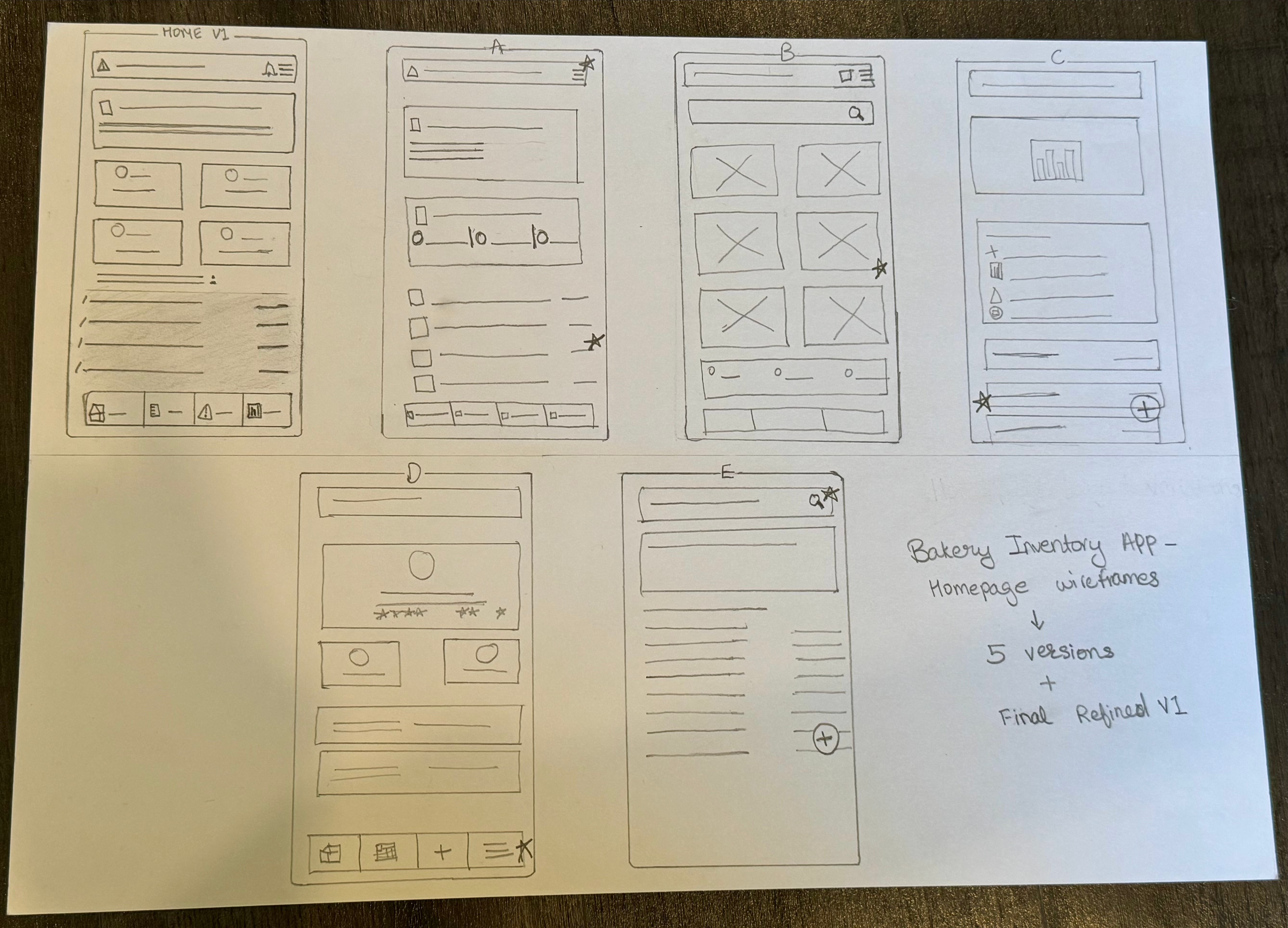
Five distinct homepage layouts explored on paper — sidebar navigation, card grids, alert placement, and bottom tabs — before committing to a digital direction.
Lo-fi → Mid-fi → Hi-fi.
Every screen refined.
The design evolved across three fidelity levels, each iteration validating structure, hierarchy, and interaction patterns before moving to the next level of detail.
Lo-fidelity
Mid-fidelity · Alerts Screen
Hi-fidelity · Ingredient Detail
Quick Reorder Flow
Order Placed ✓
Add New Ingredient
Why Farine works
the way it does.
Every decision was made to reduce cognitive load, meet the user where they think, and make the most urgent action the most obvious one on screen.
01
Traffic-light stock status system
Every ingredient shows a green / yellow / red indicator mapped to In Stock / Low / Out of Stock. Carlos can scan his entire inventory in seconds without reading individual quantities — matching his existing mental model.
↳ Reduces cognitive load · Enables instant scan · Matches mental model
02
"Production Stopped" critical banner at the top
When critical items run out, a bold warning banner lists the exact items blocking production. The most business-critical information is impossible to miss — no digging through menus.
↳ Zero ambiguity · Business impact framing · Immediate call-to-action
03
Quick Reorder as a one-tap contextual action
Every critical and low-stock item surfaces a "Quick Reorder" button in context — home, alerts, and detail screens. The form pre-fills smart defaults from usage history, making an emergency order possible in under 30 seconds.
↳ Eliminates navigation friction · Pre-fills reduce errors · Speed matches urgency
04
Usage bar + plain-language context per ingredient
Each detail screen shows a visual bar alongside "15 lbs used this week · 70% of typical" — giving Carlos context for smarter reorder decisions without consulting a separate history log.
↳ Contextual data beats raw numbers · Supports smarter ordering
05
4-tab nav scoped to bakery jobs-to-be-done
Navigation is limited to exactly four sections: Home, List, Alerts, Reports. This keeps the app learnable in one session and directly addresses the cognitive accessibility gap shared across all four audited competitors.
↳ Learnable in minutes · Bakery-specific IA · Closes competitor accessibility gap
What Farine achieved
& what I learned.
5+
Wireframe Iterations
Paper → digital lo-fi → mid-fi → hi-fi, with design rationale documented at each stage
4
Competitors Benchmarked
Accessibility and customization emerged as universal gaps — shaping Farine's core design principles
100%
Core Flows Prototyped
All 7 key screens: Home · List · Detail · Alerts · Reorder · Order Success · Add/Edit
#1
Market Gap Addressed
Bakery-specific accessibility and contextual reorder — the shared blind spot across all audited competitors
What worked well
- Starting on paper forced genuine exploration — 5 distinct homepage concepts emerged that wouldn't have appeared jumping straight to Figma
- Storyboarding grounded every decision in Carlos's real daily context rather than abstract features
- The competitive audit identified accessibility as the universal weakness across all 4 tools — giving Farine a clear and defensible design principle from the start
- Limiting navigation to 4 tabs kept the app focused and aligned with what Carlos actually needs to do each day
- The traffic-light color system resonated immediately with how bakers already think about stock in their heads
What I’d do differently
- Conduct formal usability testing with real bakery owners to validate that the "Production Stopped" banner triggers the right behavior quickly
- Design the onboarding flow — first-time ingredient setup and supplier linking would be the highest-impact missing screen
- Add the recipe module earlier — a clear differentiator that got scoped out and would have made the competitive advantage stronger
- Build multi-language support from the start — many NYC small bakery owners are non-English speakers, closing a direct accessibility gap found in the audit
- Explore a tablet layout — counter devices in bakeries are often tablets, and a responsive design would expand real-world adoption significantly
Google UX Design Certificate · Bakery Inventory Management · UX Case Study